Checkout Process Redesign & Optimization
UX DESIGN |COMPETITIVE STUDIES| PROTOTYPING
BFL Group is one of the world’s leading off-price retailers of fashion that is based in the United Arab Emirates and serves over three markets across the Middle East and Europe. Known for its unique “Treasure Hunt” model, Brands for Less ensures that there is always something new to explore, desire, and discover.

Overview
Brands For Less is one of the biggest retail stores in the United Arab Emirates and has operations in 6 countries for its physical store and caters in 12 countries from its e-commerce platform, including the United Arab Emirates, United States of America, Malta, Philippines, Oman, Kuwait, Lebanon, Saudi Arabia, India, Jordan and many more. Working at Brands For Less, I spend most of my time day in and out designing new features. And due to its fast pace of development and complicated checkout process, the design is not consistent and still has a lot of usability issues.
The Problem Statement
Why Redesign?
Let's have a look at the current checkout process. Here is what an unregistered user goes through to place an order:

Brands For Less Mobile App: Unregistered Checkout Process
Overall this looks like a typical checkout process. However, we can spot the obvious issues here.
- We have complex delivery and payment methods divided into multiple options that appear to be congested as it also displays the order summary and other payment options on each screen.
- The header does not change to represent each step. Thus, you are unable to identify your progress.
- Navigating through the checkout process is a one-way road: you cannot go back to the previous screen.
The Goal
Thousands of orders are processed every day by Brands For Less. And so, based on the problems previously outlined and information I will collect from further research, we aim to streamline and simplify the checkout process without completely changing the structure of information.
Research
Competitive Studies
The initial step in my research was to identify successful patterns in current products and determine where their unique value is lacking. Our research uncovered seven e-commerce platforms similar to Brands For Less in functionality and narrowed them down to three top competitors.
I analyzed their existing features and compared them to Brands For Less to help me understand industry standards and identify opportunities — focusing on their app checkout function and hierarchical customer journey.
Summarizing Key Insights from the Research
- Customers want a seamless purchase experience through flexible delivery and payment options.
- In a hierarchical customer journey, a step-based process plays a significant role.
- Fast and seamless transaction/customer experience increases retention and average order value.
- It is valuable for shoppers to review their orders before they place them.
Ideation
Crazy 8s — Design Exploration
Crazy 8s is an ideation technique that produces several possible solutions to solving a problem. It is a helpful technique for UI design exploration, and it is a widely used technique since it allows you to make many designs in a short period, and anyone can take part. The same principles apply to brainstorming: you trade quality for freedom and speed of generating solutions.
There are countless ideas in navigation that boil down to either of two approaches:

Two (2) Approaches For Design Exploration
However, after countless discussions and a few iterations, we have decided to redesign the whole structure and move forward with the first option to streamline the process.
Redesign Process & How We Addressed The Problem
Login / Register
The first step was to redesign the checkout page after an unregistered user clicked on the login button, highlighting their option to sign up using social accounts.
Delivery Type
As soon as the user logs in or registers, shoppers will be able to choose the delivery option shown as an accordion rather than a radio button, allowing us to display important information like the saved delivery address. We have also removed unnecessary elements from each screen to make it less congested and only display essential information.
Brands For Less offers three delivery options and there are two cases in each scenario, return customer and new customer. If they are a new customer, they will be required to enter the address where their items will be delivered or the location of the store where they want to pick up or collect their items. After the user has logged in, this will show the option to choose their delivery type.
However, if they are returning customers, the address is already saved. The app also allows you to save multiple delivery addresses. Shoppers who already have an account can select or change their default delivery address if they have previously registered.
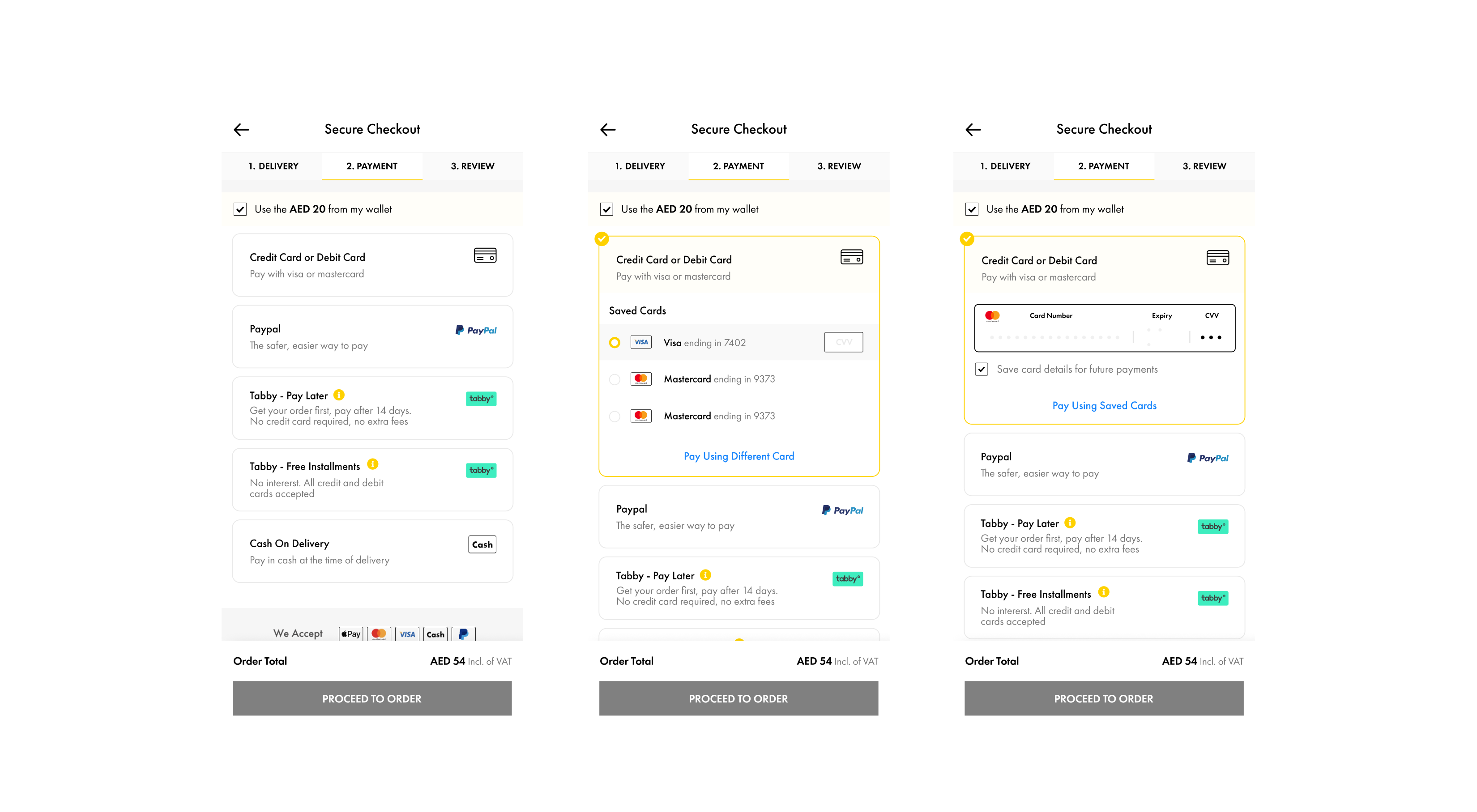
Payment Method
Recently, we have added Tabby payment to give our shoppers a more flexible way to shop. Due to fast development and the need to implement it as quickly as possible, we have only added this new feature in the payment section, but the layout and other features remain the same. So as we have outlined our goal for this redesign, we have decided to create separate pages for each important step like delivery and payment method.
Review Order
Overall, in the previous version of the app, the user didn't have the option to return to the previous screen when they wanted to make changes or select a different delivery type.
To address this problem, instead of showing a close button in each step, we replaced it with a back button and only showed a close button if it is a separate page.